A potential customer lands on your website. Maybe they searched for an emergency plumber, a dermatologist who does Botox, or a bookkeeper who works with small businesses. Within the first second, before they have read a single sentence about what you do, their brain has already started forming an opinion about whether you seem legitimate.
That opinion decides whether they keep reading or hit the back button and call the next business on the list.
Most owners assume that if they are not getting enough calls or form fills, the problem is traffic. They think they need more ads, better rankings, or another lead source. Sometimes that is true. But very often the visitors are already arriving. They show up, take one look, feel a flicker of doubt, and leave. That is not a traffic problem. That is a trust problem, and it is happening in the first few seconds.
This article explains why that snap judgment happens, what your website is silently telling people, and the specific signals you can add to earn trust quickly. The examples cover home service companies, medical and aesthetic practices, and professional service businesses, because the part of the brain that decides whether to trust you works the same way no matter what you sell.
What is the halo effect, and why does it run your first impression?
The halo effect is a well-documented mental shortcut. When people notice one positive quality about something, they tend to assume other unrelated qualities are also positive. A person who is attractive is assumed to also be smart and kind, even with no evidence. The single good trait casts a glow, a halo, over everything else.
Your website triggers the same shortcut. When a visitor sees a clean, professional, well-organized site, their brain quietly fills in the rest: this business is probably competent, careful, and safe to hire. When they see a cluttered page, blurry photos, mismatched fonts, or a layout that feels dated, the halo works in reverse. The visitor assumes the work itself might be just as sloppy, even though a messy website has nothing to do with how well you replace a roof, perform a procedure, or manage a client's books.
This is not vanity. It is how human judgment works under uncertainty. A first-time visitor has no other information to go on, so they use the one thing in front of them, your website, as a stand-in for everything they cannot yet see.
How fast do people actually decide?
Faster than most owners believe. In a study published in the journal Behaviour and Information Technology, researchers found that people form a first impression of a web page in about 50 milliseconds. That is roughly half the time it takes to blink. They are not reading. They are reacting.
Other research backs this up. In a study on aesthetics and credibility, when the actual content of a page was held identical, the versions with higher quality visual design were rated as more credible by users (Robins and Holmes, 2008). Same words, same information, a different level of polish, and the better-looking version was trusted more.
The takeaway is simple and a little uncomfortable. Before a visitor evaluates your offer, your pricing, or your experience, they have already judged you on how the page looks and feels. If that snap judgment is negative, much of your good information never gets read.
Trust signals: the proof that backs up the first impression
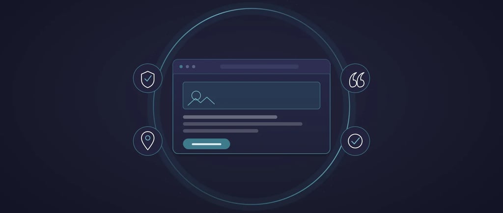
A good first impression opens the door. Trust signals are what keep the visitor walking through it. These are the concrete pieces of proof on your page that answer the quiet questions every visitor is asking: Are these people real? Have they done this before? Will I regret choosing them?
Here are the trust signals that matter most for service businesses.
Reviews and social proof. People trust other customers far more than they trust your marketing. The numbers are hard to ignore. BrightLocal's 2026 Local Consumer Review Survey found that 68 percent of consumers will only use a business rated four stars or higher, up sharply from 55 percent the year before. The same survey found that 41 percent of consumers now say they always read reviews when looking for a business. If your reviews are buried, missing, or only live on a third-party site nobody visits, you are losing people who were ready to choose you. Pull a few of your strongest reviews onto your most important pages, with the customer's name and, where appropriate, their city.
Real photos of real work and real people. Stock photos of smiling models in headsets fool no one. A roofing company should show its own crews on actual jobs. A medical practice should show the real office, the real providers, and, where allowed, honest before-and-after results. A bookkeeper or attorney should show their actual face, not a generic silhouette. Real imagery signals that there is a real, accountable business behind the screen.
Credentials and proof of legitimacy. This is the trust signal that varies most by industry, and it is one of the strongest. For home services, that means license numbers, the words licensed and insured, manufacturer certifications, and years in business. For medical and aesthetic practices, it means board certifications, provider credentials, and the specific training behind a procedure. For professional services, it means certifications, association memberships, and relevant designations. These details quietly tell a nervous visitor that you are vetted and accountable.
Clear contact information and an obvious next step. A visible phone number, a real address, and a simple, single next action remove friction and signal transparency. Hiding your phone number or burying your contact form makes people wonder what else you are hiding. Every important page should make the next step obvious and easy.
Risk reducers and guarantees. Anything that lowers the perceived risk of choosing you helps. A workmanship warranty for a contractor, a satisfaction guarantee, a free consultation for a practice, or a clear, plain-English explanation of what happens after someone reaches out. The goal is to answer the fear, what if this goes wrong, before the visitor has to ask it.
Where do trust signals belong on your site?
A trust signal only works if the visitor sees it at the moment doubt creeps in. Placement matters as much as the signal itself.
Put your strongest proof near the top of your home page and near every call to action. The moment you ask someone to call, book, or fill out a form is the exact moment their hesitation peaks, so that is where a review, a guarantee, or a credential does the most work. Reviews belong on your service pages, not just a separate testimonials page that few people click. Credentials and licensing belong in your header or footer where they appear on every page. Contact information should never be more than a glance away.
A clean design plus visible proof, placed where decisions happen, is the combination that turns a cautious visitor into a phone call.
How does trust affect getting found in search and AI answers?
Trust does not only influence the humans on your page. It also influences whether you get shown at all. Google's own guidance places trust at the center of how it evaluates content quality, describing it in terms of accuracy, honesty, safety, and reliability. Genuine reviews, accurate business information, and transparent details about who you are all support that.
This matters more now that people increasingly get answers from AI assistants and search summaries rather than clicking ten blue links. These systems pull from sources that look credible and well-structured. A business with consistent information, real reviews on third-party platforms, and clear, honest content is more likely to be surfaced when someone asks an assistant for a recommendation. The same things that earn trust from a human visitor tend to earn it from the machines deciding who gets mentioned.
One honest caution. If you want star ratings to appear in search results, they generally have to come from independent platforms like Google, not from review markup you place on your own site about yourself. Google stopped showing those self-placed ratings years ago. Collect and earn real reviews on the platforms people actually check.
A simple way to check your own site
Open your home page on your phone the way a stranger would. Give yourself five seconds, then look away. Ask yourself: in those five seconds, was it obvious what you do, who you are, and that other people trust you? If you had to hunt for any of it, your visitors are hunting too, and many of them give up.
Then look for the three things that quietly cost you trust: photos that are not yours, claims with no proof behind them, and a next step that is not obvious. Fixing those three is often the difference between a website that collects visitors and one that produces customers.
The bottom line
You can pour money into traffic, but if visitors arrive, feel a flicker of doubt, and leave, the traffic was never the problem. Trust is both psychological and fixable. A clean first impression earns you a few seconds of attention. Real reviews, real photos, real credentials, and a clear next step turn those seconds into a decision to reach out. None of it requires a bigger ad budget. It requires showing the people who are already finding you that you are exactly who they hoped you would be.
Frequently asked questions
What is the halo effect in web design?
The halo effect is a mental shortcut where one positive impression influences how people judge everything else. On a website, a clean and professional design leads visitors to assume the business behind it is also competent and trustworthy, often before they have read anything.
How quickly do people judge a website?
Very quickly. Research published in the journal Behaviour and Information Technology found that people form a first impression of a web page in about 50 milliseconds, faster than a blink. Those snap reactions strongly shape whether the visitor stays or leaves.
What are the most important trust signals for a service business?
Genuine customer reviews, real photos of your team and your work, proof of legitimacy such as licensing or board certifications, clear contact information, and risk reducers like guarantees or free consultations. These answer the quiet questions every visitor has about whether you are real and reliable.
Do reviews really make a difference?
Yes. BrightLocal's 2026 Local Consumer Review Survey found that 68 percent of consumers will only use a business rated four stars or higher, and 41 percent say they always read reviews when choosing a business. Reviews are often the deciding factor between you and a competitor.
Where should I put trust signals on my website?
Near the top of your home page and right next to every place you ask someone to call, book, or fill out a form. That is the moment hesitation peaks, so proof does the most good there. Reviews also belong on your service pages, and credentials belong somewhere visible on every page.
Will adding review markup to my own site show stars in Google?
Generally no. Google stopped displaying self-placed review ratings for businesses on their own websites in 2019. To earn star ratings in search, focus on collecting genuine reviews on independent platforms like Google and the sites your customers actually use.
Trust signals at a glances
Customer reviews
Where it goes: Home page and service pages, near calls to action
Why it works: People trust other customers more than your marketing
Example by industry: Home services: replaced our AC in one day, spotless work. Medical: a verified patient review. Professional: a client result with a name.
Real photos
Where it goes: Home page, about page, service pages
Why it works: Proves a real, accountable business is behind the site
Example by industry: Home services: your actual crew on a job. Medical: your real office and providers. Professional: your real headshot.
Credentials and licensing
Where it goes: Header or footer, about page
Why it works: Signals you are vetted and accountable
Example by industry: Home services: license number, licensed and insured. Medical: board certification. Professional: certifications and memberships.
Clear contact info
Where it goes: Header and footer, every page
Why it works: Removes friction and signals transparency
Example by industry: Visible phone number, real address, simple contact form.
Risk reducers
Where it goes: Near every call to action
Why it works: Answers the fear of choosing wrong
Example by industry: Workmanship warranty, satisfaction guarantee, free consultation.
Sources
Lindgaard, G., Fernandes, G., Dudek, C., and Brown, J. (2006). Attention web designers: You have 50 milliseconds to make a good first impression. Behaviour and Information Technology, 25(2), 115 to 126.
Robins, D., and Holmes, J. (2008). Aesthetics and credibility in web site design. Information Processing and Management, 44(1), 386 to 399.
BrightLocal. Local Consumer Review Survey 2026. https://www.brightlocal.com/research/local-consumer-review-survey/
Google Search Central. Creating helpful, reliable, people-first content (E-E-A-T and trust). https://developers.google.com/search/docs/fundamentals/creating-helpful-content
Google Search Central Blog (2019). Making review rich results more helpful (self-serving reviews policy). https://developers.google.com/search/blog/2019/09/making-review-rich-results-more-helpful